Monday, 30 April 2012

Final Piece Example


This is an example of one of the ideas I have had for my final piece. It consists of a silhouette of a woman, filled with pictures of drugs and alcohol. I like this idea as it comes across like the images are expressions of her and what is in her mind. It almost seems like the drugs in the images are what makes up her as a person however it is a secret and to the world she comes across as an average woman and she is protected by a 'mask', this is represented by the silhouette.
To be able to create this image, I got an image of a woman's silhouette and laid the other images on top in different layers. I then simply changed the blending mode to 'lighten' and fitted it to the image outline. 

Final Project Ideas


A collection of ideas in how I can present my final project.


Final Idea

I have chosen to develop the theme of alcohol and drug abuse for my final piece. I have decided however to not include the concept of the "mental high" experience, and concentrate on the negative side to drug abuse. I want to relate the images to death and portray that death could be a result of the acts. To represent this I will include images of a graveyard and pictures of a person taking drugs. I also want to include the images I used for the idea of an Urban Journey, as these are slightly positive images, I will destroy them following inspiration by Rankin. I will do this by physically destroying the image with paints and cutting and burning the image and digitally on Photoshop, this will hopefully portray the seriousness and negative effect that drugs have on people. In my final piece I will also include words and quotes  explaining how drugs negatively effected them. The whole piece will have an eerie, dark effect in the style of Giacomo Brunelli and will be all in black and white.

Lomo Effect

As research into my final project, I experimented with the lomo effect.

Using Photoshop I first raised the contrast and brightness of each shot, then experimented with Curves, changing the red, green and blue lines in order to create the colour effect. I then edited the Levels so that the shadows were exaggerated and almost bordered objects. I then changed the Colour Balance and added reds, blues and yellows throughout the highlights to shadows.


I like this effect as it gives a bright edgy twist on photographs, it also gives a sense of the photographs being old and taken in the 70s. I think that effect ties nicely into the theme of my final piece, as it comes across as how things would appear when high on drugs. 

Idea Development

To develop the final idea of drug and alcohol abuse, I took a range of images of objects that represent this theme. This was to broaden my range of photographs from only portrait images. 
These are the original images taken in colour, I want to experiment with colour and effects to perhaps contrast the dark eerie pictures already in the collection. 


I like the above picture and how the dried paint spills down the side of the can and the dirty inside contribute to the unappealing content and create an undesirable picture. 


The above images are to represent the "cocaine" power. I like the close up nature of the first picture and how the   seriousness of the power contrasts the calming nature of the candle. 


This shot was to represent the process of taking the drug heroin. I like how the candle is in focus however you can still see its purpose and the spoon and its content. This makes the objective of the photograph apparent but subtle instead of being harshly blunt. 


This is a macro image of the content of a pill. 


I like how the sun captures the powder in the bag of the above shot and how there is a natural shallow depth of field. I also like the positioning of the bag in the photograph and the fact that is not straight to the shot nor in the centre. 


I took the above shots from a high angle to create an interesting persepctive on the bottle(s) instead of a traditional straight on view. I also like how the glass in the first shot it blurred creating the focus on the vodka bottle. 


This shot is supposed to represent the arm of a heroin user. The blood and visible veins hopefully portray what the image was aimed for. The shot however is not great and needs to be edited to raise the contrast and brightness to make it more interesting. I am also unsure if it presents its intention. 


Monday, 23 April 2012

Exam Idea: Babies

This idea was based on the them of experiences of a new life. I took portraits of babies and toddlers and experimented with how they reacted with different objects and surroundings by their facial expressions and movements.


The above images were taken of a very young baby. I experimented how he reacted with being held by his mother to being alone. The pictures were originally taken in black and white and I only edited the brightness and levels within the pictures to make the contrast higher. The first picture could have been improved by a higher contrast level as it currently looks slightly dull.


The above pictures were taken outside in the sunlight therefore I did not have to do much editing apart from contrast and saturation levels. I also experimented with blurring the background with the Gaussian Blur tool to create the focus on the child in the foreground.


This is my favourite picture of the collection. I edited it to make it black and white and also changed the levels to make the contrast of the background and small areas of the clothing and facial features like her eyes appear darker. I like how in this image she is reacting off of an object as it adds other elements in to the shot. I also like how there is a focus on her eyes and facial expression. I finally edited it to make the background blurred using the Gaussian Blur tool to make the focus on her. I think the picture looks better in black and white rather than colour as it presents a slight feel of innocence, it also draws attention to darker areas of her features. By making the photograph black and white, it keeps the focus on her as there is no distraction of other bright colours in the background. 

Exam Idea: Urban Journey

These photographs were to represent the concept of an urban journey. I set the photographs on streets and included images of smoking to represent urban youth culture. 

For all the images I edited them in Photoshop from colour to black and white. I then raised the contrast and brightness levels slightly. I also edited the levels and made the contrast between shadows and highlights greater. I selected each background and added gaussian blur to make the subject stand out in the foreground. 


I like how this photograph is symmetrical and the subject is central in the shot. To improve, the image could have had a higher contrast and brightness level to make it more eye-catching. The subject could have also been closer and more in the foreground of the shot. 


I like the composition of this shot, how the subject is on the right but is looking into the left of the image. I also like how the pose is different by the left leg and right arm being raised and the shot comes across as natural.


To improve, the above shot could also have been edited to have a higher contrast and the subject could have been more in the foreground to distinguish her more from the background.


I like the composition of the above picture and how the subject is leaning into the shot which contrasts with the harsh straight lines of the lamp post and road markings. I also like how the tones are contrasting, for example the darkness of the lamppost compared to the highlights on the road and in the background. 

Photoshop Effect Experimentation


I edited the above picture by changing it to black and white and taking down the brightness and raised the contrast a lot so that the shadows of the image were exaggerated. I then changed the Colour Balance so that blue was more apparent in the shadows and yellow in the mid-tones, this created an eerie atmosphere to the shot. I then created a black vignette around the edges so that the focus of the image was on the centre headstone, I finally lowered the opacity of the vignette so that it blended with the background.


I took the first image and added another layer and copied in an image of rain. The image was predominantly blue  so when I changed the blending mode to Difference, it created the above effect


I then experimented with other colours in using the Colour Balance tool and Blending Modes and then finally chose the Subtraction mode which gave this effect. I like how it changed the image as it made it look old and gloomy and a slight sepia effect. 

Exam Idea: Death

I have explored the experience of death and afterlife by photographs of a grave yard. I tried to concentrate on head stones and how the light reflected off of the stone and created different textures within the photograph. 

I edited the pictures in the style of Giacomo Brunelli and tried to create a dark, eerie and morbid effect. Using photoshop I edited all the images from colour to black and white. I then enhanced the contrast levels and reduced the brightness of the image. I then changed the levels of each photograph to make the shadows more visible and to contrast the highlights from the dark tones. I also edited the colour balance to enhance the blues of the shadowed areas and the yellows of the mid-tones.  To each image I created a black vignette and changed the layer style to overlay and reduced the opacity, this created a central focus of the image and enhanced the morbid feel of the image. 


I am very pleased with the above shot. I like the position and composition, especially how the branches of the tree spans across the top of the photograph creating a border, also how the headstone is in the center and foreground of the photograph. I also like how the headstone in the foreground is dark and creates an eerie effect which contrasts the highlights on the stones in the background. Finally, I think the editing of this shot successfully creates a morbid atmosphere through the use of the vignette which draws the focus on the central headstones. 


I like the composition of this shot and how the stone texture is captured in the light. I also like how the shot is positioned and the head stone is not central and is taken from an angle. The lighting is important to the shot, I like how the face of the headstone is highlighted and the corners and background contrasts in the shadows. 


I think this shot is slightly boring and uninteresting, however I like how the shadows make the design on the top of the headstone clear and sharp. The contrast of the shot could have been better and included more highlights of certain areas as the bottom of the headstone is lost. 


I am not really pleased with this shot, it is too dark and the contrast is too low and because of this the subjects get lost in the background. The composition and positioning of the shot is not interesting and the subjects are not in the center and the shot is at a slight angle.

Friday, 20 April 2012

Material Experimentation

I experimented with scanning in objects, materials and writing and overlaying them on pictures in photoshop.


For the above shot I scanned in "IT RUINED MY LIFE" written on tracing paper, and then added it on top of a photo in photoshop. I then duplicated the layer and set the blending mode to "Darker Colour"


This shot included a scanned in image of a sketch using a black pastel. I then added it over the image and reduced the opacity. I like the effect of confusion and pain it brings to the shot along with the pose of the model.


This shot included a scanned image of staples on tracing paper, I over laid them in photoshop and duplicated the layer so there was more of them . I then changed the blending mode to Linear Burn.

Thursday, 19 April 2012

Colour Experimentation

To edit these pictures, I used Photoshop and duplicated the background three times and made the background layer black and white and added Gaussian blur. With each other layer I selected a small area and deleted the rest of the image. I then enhanced the contrast and brightness on these areas and added a black box to border them. 


Layer Experimentation


Here I experimented with layers in Photoshop


In the above picture, I collated two original images and erased an area of the top layer and reduced the opacity. I joined two pictures that present contrasting emotions of anger and happiness. I then created a vignette on another layer and reduced the opacity to highlight the facial expressions of the subject. 


In this photograph, I used the first image and added another image of the subject with another contrasting expression of shock. I then changed the opacity of all three images so that they merged into one. I also changed the levels in the photograph to make the contrast between highlights and shadows greater. Finally I added a picture of a full ashtray and changed the layer blending mode to extraction, this changed the colours and made all three layers blend together so that all were visible. I then changed the opacity of the ashtray so that the faces were clear. The final outcome related to the exam theme of drugs and alcohols and the effects. 


The final image was to represent 'Hear no evil, see no evil, speak no evil'. I tried to recreate the well known figurine, so I positioned each photograph above each other. I then experimented with colours and raised the contrast and brightness level to make each image stand out. I then changed the blending mode so that each face was visible, finally I added a vignette and reduced the contrast so that the focus remained on the subject.

Monday, 16 April 2012

Trent Parke Analysis

ANALYSIS

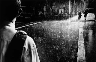
Trent Parke is the only Australian Photographer represented by magnum. His street photography is known world wide and he is often recognised for his dark, mysterious pieces. He is renowned for his 21st century take on old style photography. He often shows harsh concepts and raw images to represent his beliefs on our society. 
This is why his work is hugely inspiring as it links to the raw drug and alcohol idea that I have. He produces work to present his feelings and beliefs and is unconcerned about how people judge him, he, like myself wants only to tell the truth through his shots. 


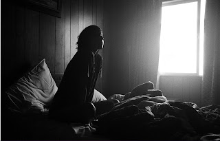
I love the abstract nature to this photograph and how it includes so many different elements but no singular area stands out more than the other. I like how it includes different parts of the body and throughout each singular aspect presents a tone of sadness. I also like how the contrast of light and dark and silhouettes have been used to highlight different elements of the photograph.


I love how this picture is in black and white as it tells the story of lonliness and helps viewers to focus on the main areas of the photograph. The tones have been edited so that the contrast between black and white is greater and an eerie atmosphere is set. I also like the way the rain has been captured in the light area of the photograph, concentrating on single droplets. The photograph tells a story of adventure and experiences without having to concentrate on faces or portraits. I also like the lighting in the photograph and how highlights and shadows have exaggerated.

Dave Hill Analysis

ANALYSIS


The above pictures are from Dave Hill's collection "Adventure". I really like how the photographs have been edited and the colours have been enhanced. Throughout the collection the images present a cartoon style and extreme adventure and mission like themes. The shots all look like they have been taken from scenes within an action film and could possibly be used as promotional or advertising tools. 
I most like the colours used and how they are eye catching and exaggerated, and how the shots almost include the audience and bring the action alive. 


These images above are from another collection from Dave Hill called "Black and White 2". I particuarly like this collection as it shows such a broad contrasts between the styles of photographs he takes. These pictures are all black and white and edited to appear gloomy and mysterious. The exaggeration of highlights and shadows demonstrates the emotion within the pictures which often is seen to be desperation, sadness and lonliness. The positioning and styling of the models is also a key factor in his photographs as they help to portray a story or present an emotion through the awkward angling of their poses.